Thursday, December 11, 2008
Tuesday, December 9, 2008
Collage Poster
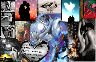 Passion
I spent a good deal of time on this project since i really enjoyed playing around with tools. I focused on the word 'passion' and romance/love and was going to use some pictures displaying the opposite-arguing/conflict but decided not to because it looked better this way. I tried to include many colors, yellow was added at the end in the image down in the lower left hand corner and repeated in the dancing illustration in the middle as well as the part with the fire slightly below that. I didn't know you could use erasers with edges like stars like shapes and grass like shapes and so many more cool ones... Since I didn't know this before I used it alot in this collage including many of the different sized star like shapes as you can see in the fire and in the background of the two kissing on the top left colored picture with a redish orange sunset behind... I like how you can't tell I even added it but it somewhat looks real. I changed some of the filters in some images using pin light, hard light, linear light, difference twice, and screen. There are 24 layers overall and I put black behind some, for instance, in the one with the couple kissing in the rain on the left side because it added a cool effect. Overall I am pleased with the outcome.
Monday, November 10, 2008
Poster #2: Movie Poster
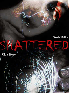
I am pleased with the outcome of this image, we were supposed to create a movie poster, choosing a word such as an adjective, and expressing the word through the text/and or images used. I chose the word shattered, at first actually making the word look like it was broken, but then changed it to this because it was too much with my final image created. I took two images: one of a woman/mother holding her son/a young child and layered it with shattered glass, changing the opacity quite a bit to 64% and using the vivid light effect on the glass layer. The movie title was placed in the center, using red as the color, since I wanted the movie to be about domestic violence and this woman losing her son because of it. I think the color red shows that the movie would be more violent, even horrific, since red is usually signifying blood, fire or violence. It stands out much more than if I used white or gray considering in my final image there are so many shades of black, gray and white. I didn't think it was appropriate to add more text than the actor's names since there is so much going on in the image making it look too busy or cluttered.
Poster #1
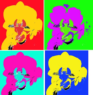
I kept this simple because most photography posters are kept pretty basic and simple...I would have liked to add more to the background of the flowers or something but I didn't find what I would have wanted. With the flowers I used the distort application, choosing to twirl them slightly, also blurring the image with the blur tool, then went in around the flower's petals so they were slightly faded. I changed the colors a little bit, making them appear more pink than the original image, and also somewhat changing the opacity. I chose a black background unlike most white backgrounds that photographers use for their posters, keeping the text to a minimum.
Tuesday, October 14, 2008
Impressionistic Self Portrait
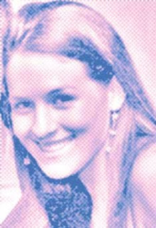
This self portrait I first cropped myself from a picture taken with someone else, then used different filters to get a different effect, such as film grain, the half-tone pattern, and the diffuse glow. I changed the RGB colors using just the blue in channels, turning the red and yellow off. In color balance I changed them to 100% for each as well as changed the shadows and highlighting in certain areas.
Matisse assignment
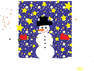
This assignment was done on Adobe Illustrator to create something similar to the work of Matisse or Picasso. I did something similar to one of Matisse's paintings where he uses stars contrasting with his background. Blue and orange are complementary colors and contrast greatly with one another, and I added yellow since it has the same effect.
Saturday, September 27, 2008
Blog # 3- Surrealism
Surreal Project 9-26-08
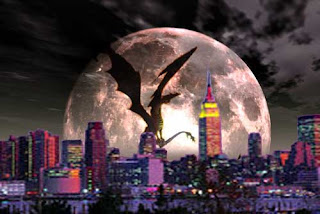
For this project I used three images and layered them...First I took the image of New York City with a purple background and used free transform to scale it to look right with the moon background. The eraser tool was used to erase the purple background. I also used the 'multiply' option to make it less see through (some of the buildings seemed to have a little bit of a see through effect which I didn't want). Next I found a picture of a dragon and layered it with the others, free transformed it so I could make it in the exact position I wanted it in and scaled it to the right size. I wanted to make it look like the dragon is sitting on a building, but the top of the buildings aren't all wide enough so hopefully it looks okay. After erasing the background with the eraser tool(which became rather tedious getting inbetween his wings, etc). I then darkened him since he sort of had a little bit of a very thin outline from not getting close enough with the eraser, so darkening it took care of that so it wasn't visible. I enjoyed creating this and can hopefully continue learning more photoshop techniques to use for the next project.
Subscribe to:
Comments (Atom)